What Is an Equity Curve? How to Read It in a Trading Backtest

Updated: Oct 3
An equity curve is a chart that shows how a backtest’s cumulative results change over time. It shows the path of gains and losses across the test, not just the final reported result.
Understanding the meaning of an equity curve can help you see whether results developed steadily, included sharp drawdowns, or depended on a few large moves. But the shape of the curve still needs context.
Already have backtest results?
If you already have an equity curve and statistics like net profit, maximum drawdown, profit factor, and trade count, Backtest Triage LITE gives you a structured Excel workflow to organize and review the results you already have.
What Does an Equity Curve Show?
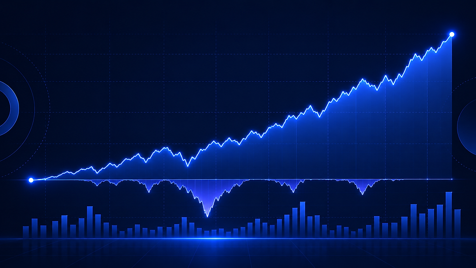
An equity curve is a chart showing how cumulative profit or loss, or account equity, changes across trades or over time.
Depending on the reporting platform, the curve may show results from closed trades, changes in account equity that include open positions, or another calculation method.
Understanding which calculation is being displayed matters when comparing backtest reports.
How to Read an Equity Curve
Start by looking at the overall movement of the line.
A rising curve indicates that cumulative results increased over the period shown. A falling curve indicates that cumulative results decreased.
However, the direction of the line is only part of the picture.
Consider these questions:
Does the curve rise gradually or depend heavily on a few large gains?
Are there extended periods when cumulative results decline?
How much of the reported improvement occurred near the end of the test?
Does the chart include open-position changes, trading costs, and all relevant trades?
A rising equity curve does not establish that a strategy will produce similar results in live
trading.
A Fictional Equity Curve Example
Imagine two hypothetical backtests that each report a net profit of $5,000.
Backtest A shows relatively gradual increases in cumulative profit, interrupted by several smaller declines.
Backtest B shows substantial fluctuations, including a large decline followed by a sharp recovery near the end of the test.
Both report the same final net profit, but their paths to that result are different.
The equity curves help reveal those differences. They do not, by themselves, establish which strategy is more reliable or what either strategy might do in the future.
These examples are fictional and are provided solely to illustrate how backtest statistics can differ.
Why Maximum Drawdown Matters
Maximum drawdown describes the largest reported decline from a peak to a subsequent trough during the measured period.
An equity curve helps visualize these declines, while the maximum drawdown statistic summarizes the largest one according to the report's calculation method.
When reviewing a backtest, consider both the overall cumulative result and the declines that occurred along the way.
Two backtests with similar net profits may have substantially different maximum drawdowns.
Why Trade Count Matters
An equity curve also needs to be considered alongside the number of trades included in the test.
A curve based on 20 trades represents a different amount of observed trading activity from one based on 500 trades.
Neither trade count alone nor a smooth-looking curve establishes that the reported results are repeatable.
The test period, market conditions, trading costs, and assumptions used to generate the results also matter.
What an Equity Curve Cannot Tell You
An equity curve is a visual summary of reported historical or hypothetical results. It cannot independently establish that:
The backtest accurately represents live trading conditions.
Trading costs and execution assumptions are realistic.
The strategy will produce similar results in the future.
The results are free from overfitting or other testing limitations.
It is one piece of information to consider alongside the rest of the backtest report.
Putting the Numbers in Context
When reviewing an equity curve, consider examining the corresponding net profit, maximum drawdown, profit factor, trade count, and average profit per trade.
These statistics describe different aspects of the reported results. Looking at them together provides a broader picture than relying on the appearance of a chart alone.
Already have the numbers? Give them a structured review.
Backtest Triage LITE is an educational Excel workbook for traders who already have backtest results and want a clearer way to organize and review reported statistics alongside the equity curve.
Backtest Triage LITE is an educational backtest review tool only. It is not financial or investment advice. Past, simulated, or hypothetical results do not guarantee future performance.